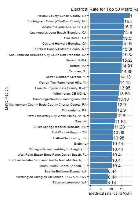
Inspired by this post, I took a bit of time to hack together a quick bit of code to display the residential power rates in the 50 most populated metro regions per the US Census Bureau. The results below the cut still need a bit of work – the labels are cut off, there’s an excess of chart junk, etc. – but it was a fun morning project while putting off hitting the trail for a run.
It’s nice to see that the Seattle Metro region still has great rates on power (largely due to our heavy hydroelectric infrastructure). As a new home owner in an old and fully electrically heated house, I shudder to think at what my bills would be like in other parts of the nation!